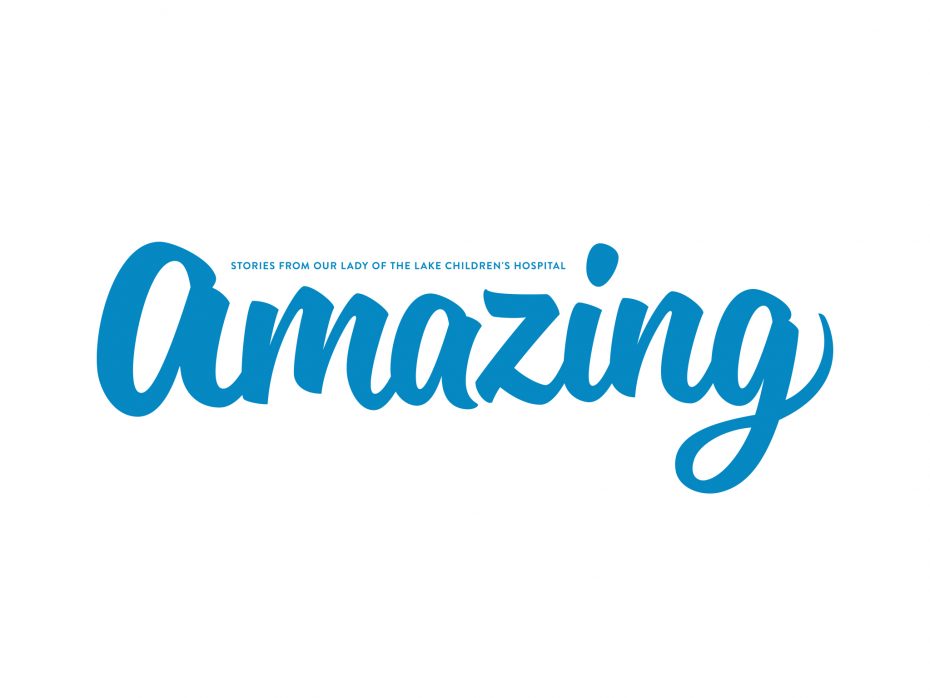
Amazing Magazine Masthead
Graphic Design
When Our Lady of the Lake Children’s Hospital decided to rebrand its magazine, the marketing department named it Amazing for several reasons. The current campaign was “Kids are amazing, and we’re doing amazing things for them,” and the hospital’s foundation was running a capital campaign titled “Let’s Build Amazing.” Although it’s unwise to name a magazine for a campaign, the slogan had become a tagline for the children’s hospital itself, and was going to have a long shelf life. Somehow, the often-overused word amazing had never been used in the Baton Rouge market, and now it belonged to us.
The masthead eschews momentary trendiness for a slightly retro script that is extensively customized, with some letters being redrawn. The thick-yet-jaunty shapes suggest the magazine is solid, yet whimsical; the script is inviting and friendly; the masthead can change color without losing identity. It is controlled enough to be a corporate face for health care, yet bouncy enough to represent a children’s hospital. Finally, it serves as an unexpectedly light introduction to a hospital’s magazine that is surprisingly playful on the inside.


