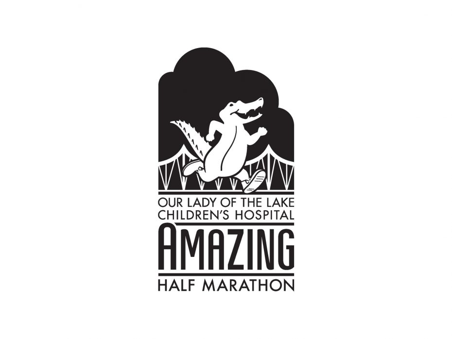
OLOLCH Amazing Half Marathon Logo
Graphic Design
The logo for the inaugural Our Lady of the Lake Children’s Hospital Amazing Half Marathon had to shoulder more responsibility than simply its long title. The logo’s objective was to convey the excitement and uniqueness of a half marathon that is sponsored by a children’s hospital yet intended for adults, and show both statewide Louisiana flair and local Baton Rouge identity. Since this was our hospital’s first time sponsoring a race, I researched marathons throughout the world to determine art styles and conventions for the target audience—casual and serious runners who participated in half marathons to qualify for larger events. As I worked with the event producers, I learned our runners preferred highly themed, fun events marked by strong branding; simply put, the runners wanted to feel part of something special.
Since alligators are widely identified with Louisiana, I knew a cartoon gator could represent both the children’s hospital and our state. This alligator has left his swampy home to run across the landmark bridge that spans the Mississippi River into Baton Rouge. In one mark, I tied our state to our local market. Athletic crests from the Art Deco period typically stacked lines of text, inspiring the perfect way to fit the race’s lengthy title into a cohesive logo. I modernized the vintage style by punching forms out of negative space and allowing clouds to frame the lockup. Despite its cartoon alligator, a limited color palette and industrial typefaces keep the logo mature enough for adults.
The crest’s cohesive, stacked format also allowed easy conversion into race medals and other paraphernalia. I quickly found I could simply imprint it onto flags, window clings, banners, and signage, and the branding carried through without needing additional imagery of runners or races.


